Keeping UWaterloo well fed
Problem Space
Between menu hell and copius amounts of scrolling, the fundamental usability of UWaterloo food services' website is challenged. Key information about opening hours and dietary values are not provided in a way that meets busy students' needs.
With food being a physical requirement for human survival, students prefer to visit off campus food outlets. Thus, our high level goals were to help UW Food Services achieve the following:
My Role
As a part of a four person group, my role was not only to create a survey and analyze its responses to inform design goals, but also to create the UI/UX design.
Validating the problem
With the help of an online survey, we gathered information from 186 students. Early results confirmed our personal pain points towards the problem.
70% of users browse the Food Services website on mobile.
The top three tasks carried out by users on the website were as follows:
Digging deeper into data
Further analysis of the data revealed a mismatch between what customers wanted, and what UW Food Services was offering.
Students are creatures of habit.
Surprisingly, 80% of students indicate that they usually know which location they intend to dine at. To add to this, more than 50% usually know which dish they intend to order.
Takeaway: Location discovery is not as important as helping users find a food item that suits them.
Although location is the 2nd most important factor, food quality is king.
Two-thirds of survey respondents actually prefer dining off campus or at home despite the inconvenience. Survey results towards restaurant selection criteria identifies food quality as the #1 most important factor contributing to this. It is the only criteria where no respondents indicated that it did not matter, or doesn't matter much.
Takeaway: UW Food Services needs to gather user feedback in order to improve food quality and customer satisfaction.

Enabling creatures of habit.
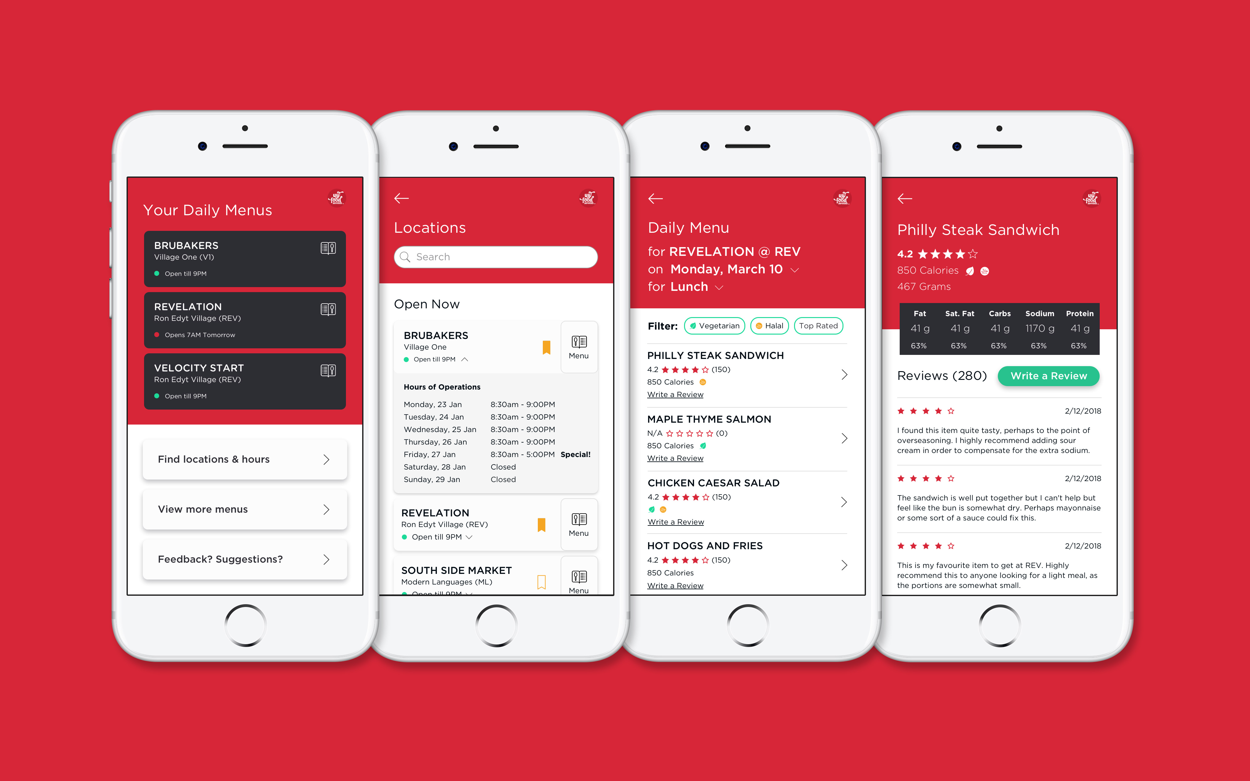
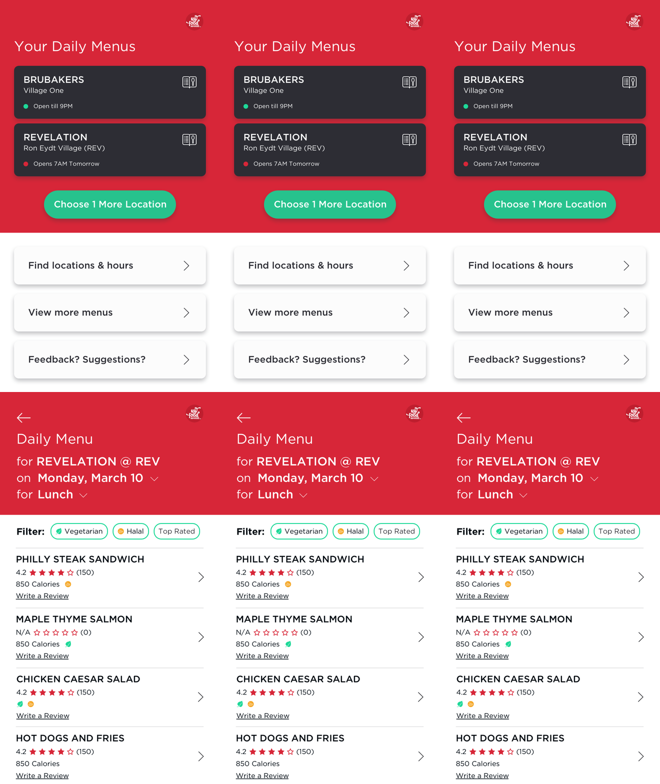
UW Food Finder immediately helps determine whether your top three locations are open. One tap access to daily menus helps you find the dish you're craving.
No more scrolling through long lists to find the same information you're looking for everytime.
Making it easy to fulfill core human needs.
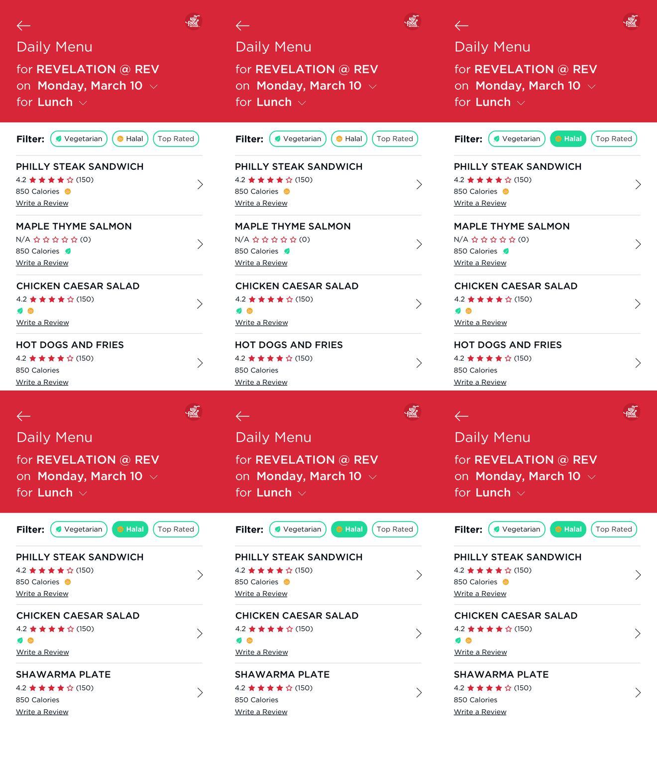
Let others help you pick from today's top rated dishes or quickly filter to find one that suits you.
Dietary restrictions, calories, and ratings provide only the key information to keep decisions simple.
Enabling enthusiasts to do more.
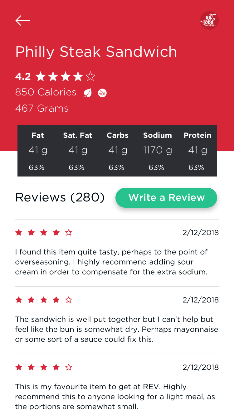
For students counting calories, tracking macros to bulk, or on a keto diet, all the critical nutritional info is now easy to interpret without having a read a complicated nutritional facts label.
For the foodies, detailed review information is available in detail for them to peruse.
Takeaways
In the end, the design direction and requirements obtained from data analysis helped our team achieve the highest score for the course project. If we had more time, features we would have implemented includes badging to help users quickly understand the aggregate meaning of user reviews for each dish.
Data Analytics
The user survey was particularly helpful with challenging assumptions and prioritizing features with its 186 responses. In particular, we were surprised that 80% of users usually knew where they were going to eat, and that only 18% said that reviews would be very helpful in dish selection.
Design
This was my first project in Sketch. Compared to Adobe XD, I definitely prefer the customization of
symbols, and separate view for creating and editing symbols that Sketch allows.
Home Yelp Butler UW Food Finder Photography